

Project Duration
Fall 2019 (2 months)
Team
Sole Designer
My Role
UI/UX Designer
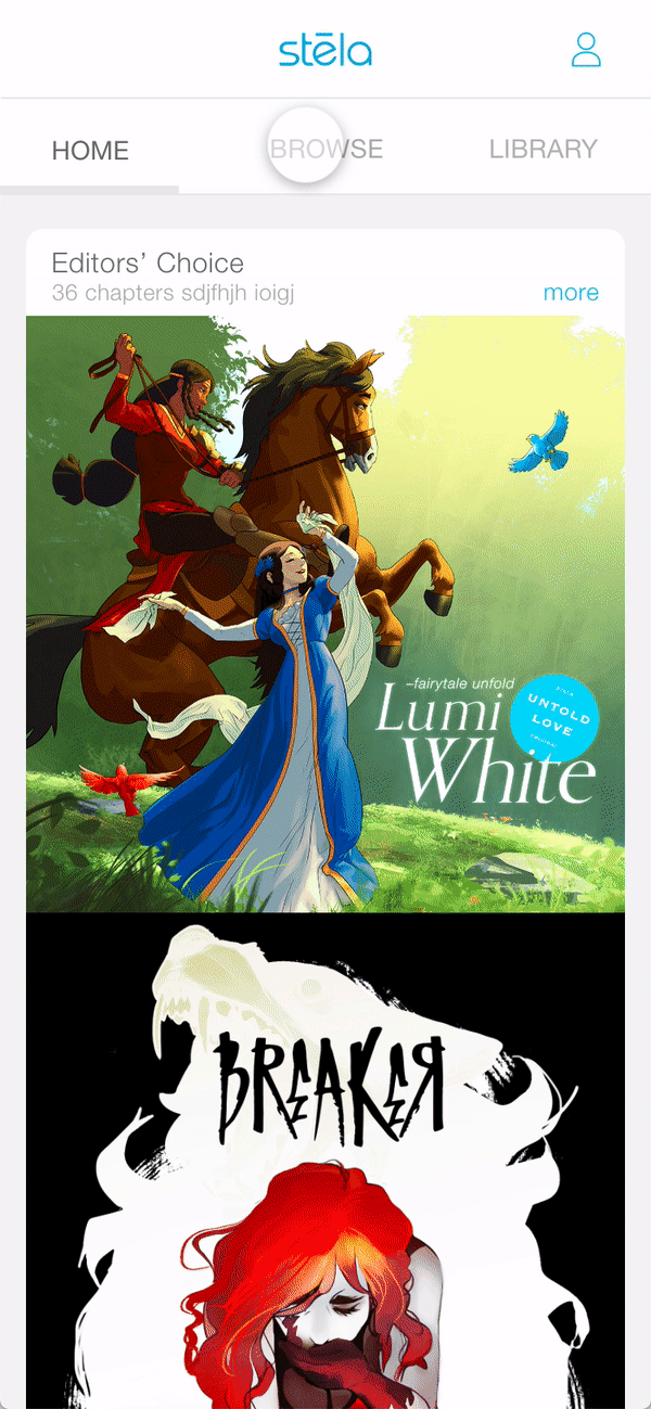
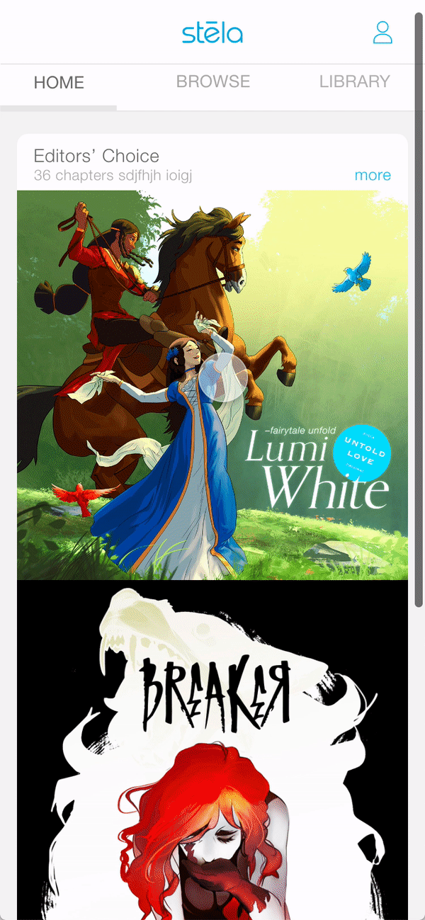
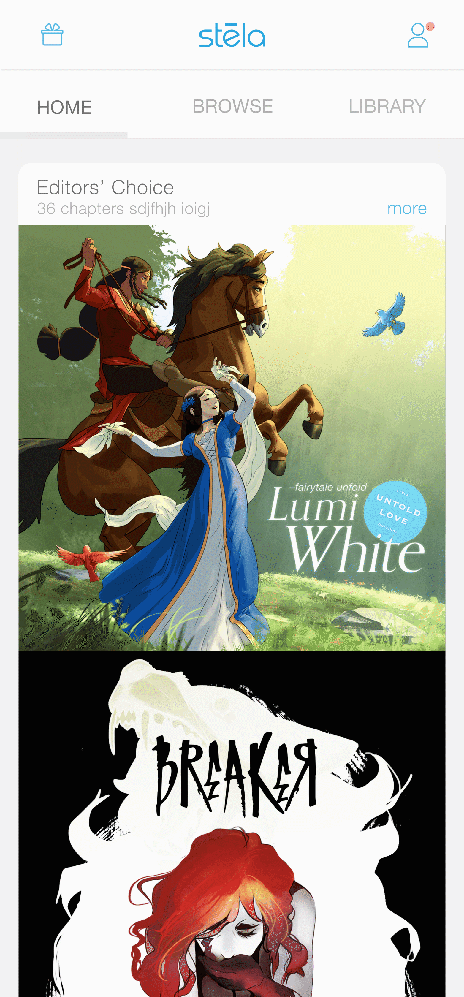
Stela App 2020
Stela, a subscription based comic reading app. Most of the content from the app are original made by in-house writers and artists. In this project of my portfolio, I will show the process of creating a new payment model of Stela App.
PROBLEM AND GOAL
The consumption speed of contents in the app is much faster than the content production speed. Eg, an average-length chapter of a comic or graphic novel on Stela app will take 30 days to produce but a reader can finish reading it in about 3 mins. As to technical constraints of comic or graphic novel content development, the content growing speed won’t be able to catch up customers’ fast consumption speed.
The goal is to balance content consumption needs versus production constraints, and maximize business benefits while building great customer experiences.
OUTCOME

APPROACH EXPLORATION
"Why and why not subscription?"
The subscription model Stela has right now is purchasing $9.99 every month to get all content in the app. It helps build customers' loyalty, but it speeds up content consumption and makes it harder to get enough revenue for company.
When it comes to comic in my childhood...
I remember when I was a kid, I was always waiting for a new chapter updating of my favorite comic. Some times I would go to those comic stores to rent the popular one. Why don't we go back to those days?
Then I came up with the following 3 solutions:
Solution A
Subscription for every month;
users can only redeem limited chapters everyday
Solution B
Subscription for long term pass: 3 months or 1 year
Solution C
Rent individual story, no more subscription


Strengths:
Efficiently slow down the reading speed
Weakness:
Causing user frustration
Strengths:
Easy to understand
and possibly make more revenue
Weakness:
Losing user loyalty
Strengths:
Get revenue in short time
Weakness:
Raising the bar of user purchasing
What We Tested
After team discussion We decided to go with solution A and I completed the whole user flow and wire frame to have tests with out target users.


Usability Testing Results
1. People don't understand
I surprisingly found that the "redeem" concept is too complicated and the progress bar is not clear to convey the idea to reader.

this was a typical user reaction
2. People don't like it
Once customers found they only can read 1 chapter everyday, they become frustrated
How about merging them into one ?
After some brain storming with founder and product manager and low-fi wireframe user test, we decided to combine the subscription model and the rental model.
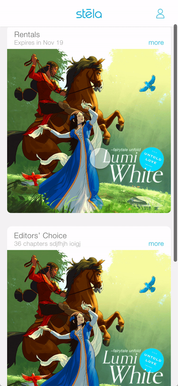
Users can choose subscribe for 3 month or one year to get all content in the app. They also can choose to rent the books they want. Customers have 30 days to start reading and 72 hours to finish it after start reading.
Final Solution

NEW FEATURES NARRATIVE
1. Rent a single book or volumes
Customers can choose the comics they are specific interested in to rent. Meanwhile, since some of comics have a lot of chapters. We decided to split them into several volumes.
2. Subscribe for 3 months or 1 year
Users can still choose to buy a 3-month pass or 1-year pass to have access to the unlimited content in Stela app.
3. Customize your library
All the comics could be added to collection, rentals and wishlist. Customers can build their own library to get what they want efficiently.
UX FLOW
Based on feature narrative, I began to construct the user experience flow, taking into consideration the following:
1. First time user, renting experience
3. Return user(rented), reading experience
2. First time user, subscribe experience
4. Return subscriber, reading experience
DESIGN EXPLORATION
The user interface design system would be based on the last version which is also created by me. However the layout, hierarchy and "call to action" of the series info page needs reconsideration.
the following are the concerns I have for last version of app:

1. Two tabs for series info and chapters
Merge them into one page would make it flow more direct and simple
2. Chapters condition
Try to make"read, unread, last read" conditions more clear through different type setting.
3. The position and size of the button
Those 3 buttons are too small and the position are unreasonable
First Proposal
After I presented this proposal, I got the feedback from founder, PM and our target users. From business side, the company would like to have our customers rent more volumes rather than subscribe. From user side, they complained that there were too many buttons on this page and can not get the main description quickly.
So I decided to simplify layout and change hierarchy.

Second Proposal
In this iteration, although the page is simple and clean. I came across with the problem–how is the "expiration date" showed?
After some discussion and research, I think I was lost in the format of old structure of Stela app. Is it necessary to show all chapters in a list when the comic has so many volumes? How about making a vertical volume list rather than horizontal one?
With those questions and thoughts, I came up with the following decisions:

Final Design

STYLE GUIDE
INTERACTION DESIGN
New user rent flow
Rented user reading experience
New user subscribe flow
New User Gift
REFLECTION
As the sole UX/UI designer in this project, I stepped out of my comfort zone by taking on a variety of research, design thinking and product management responsibilities. My job used to be making things look pretty, however,
I found out that looking good is not enough for a good product.
This end-to-end design experience gave me a good train of thinking the product as a whole and looking into every detailed action in the user flow. Everyday I came across lots of problems and I kept asking, discussing and quickly iterating. I do enjoy this process and feel so proud of the outcome.